Often, when small businesses get booked up with client work, the first thing to fall to the back burner are internal tasks.

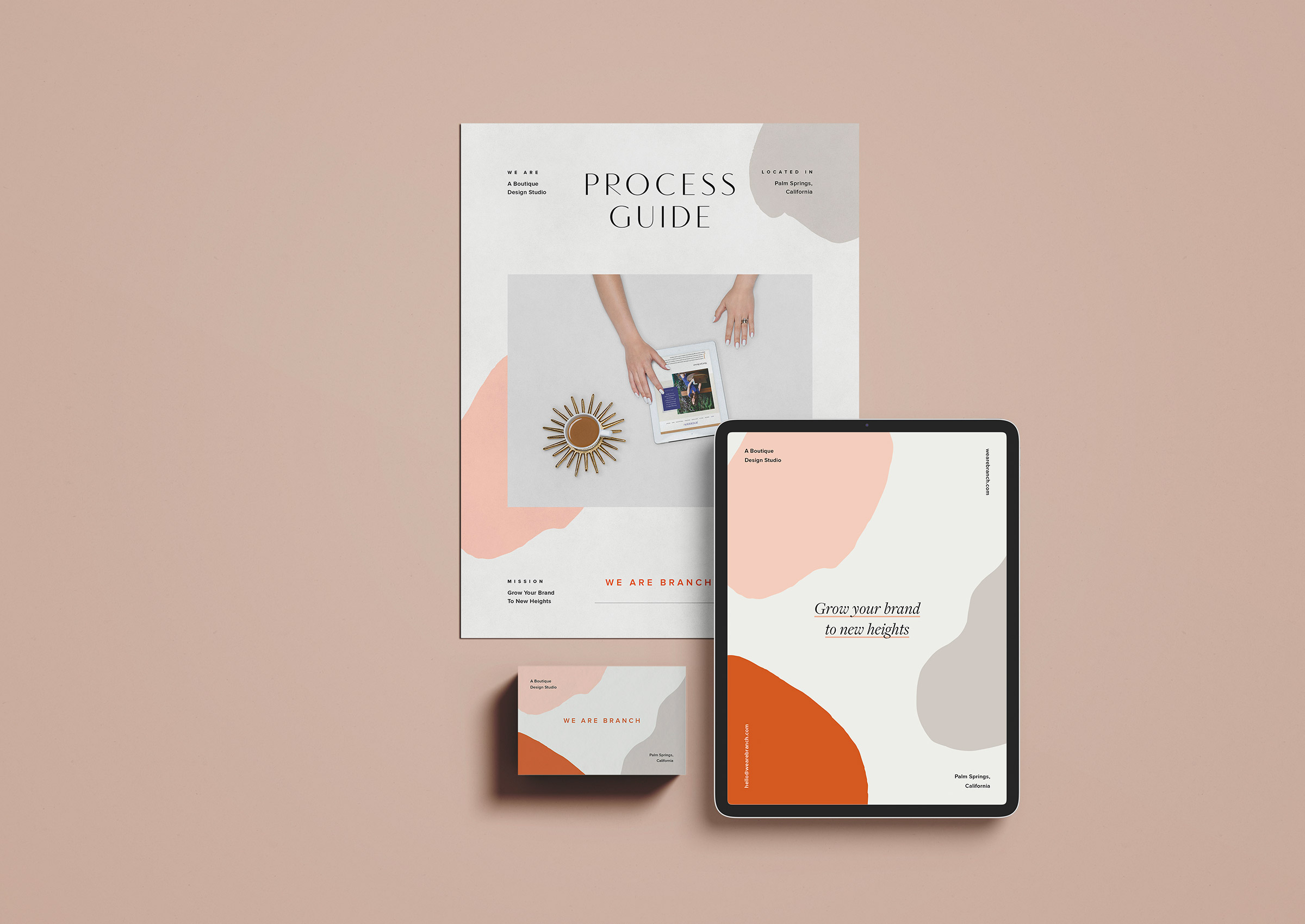
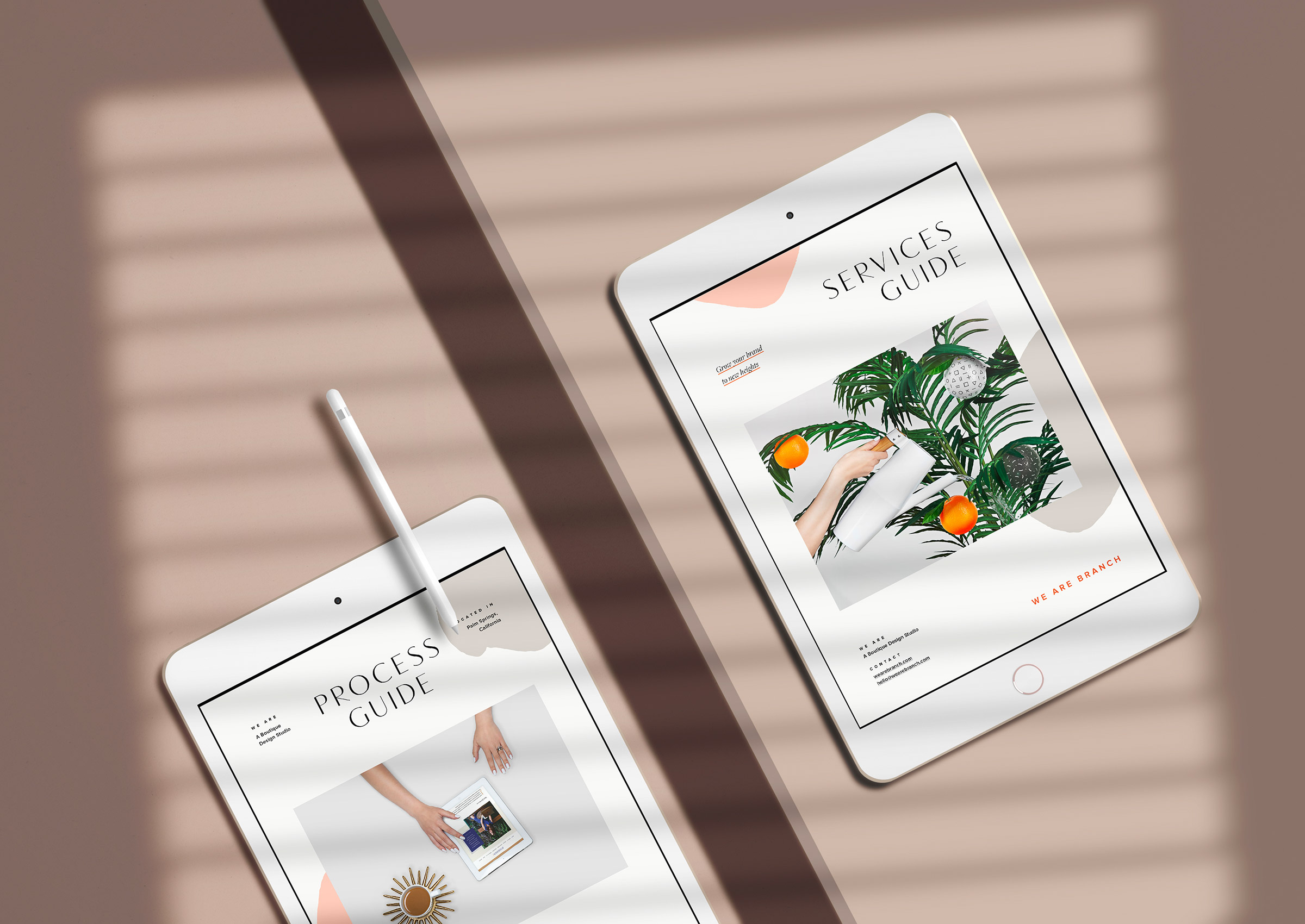
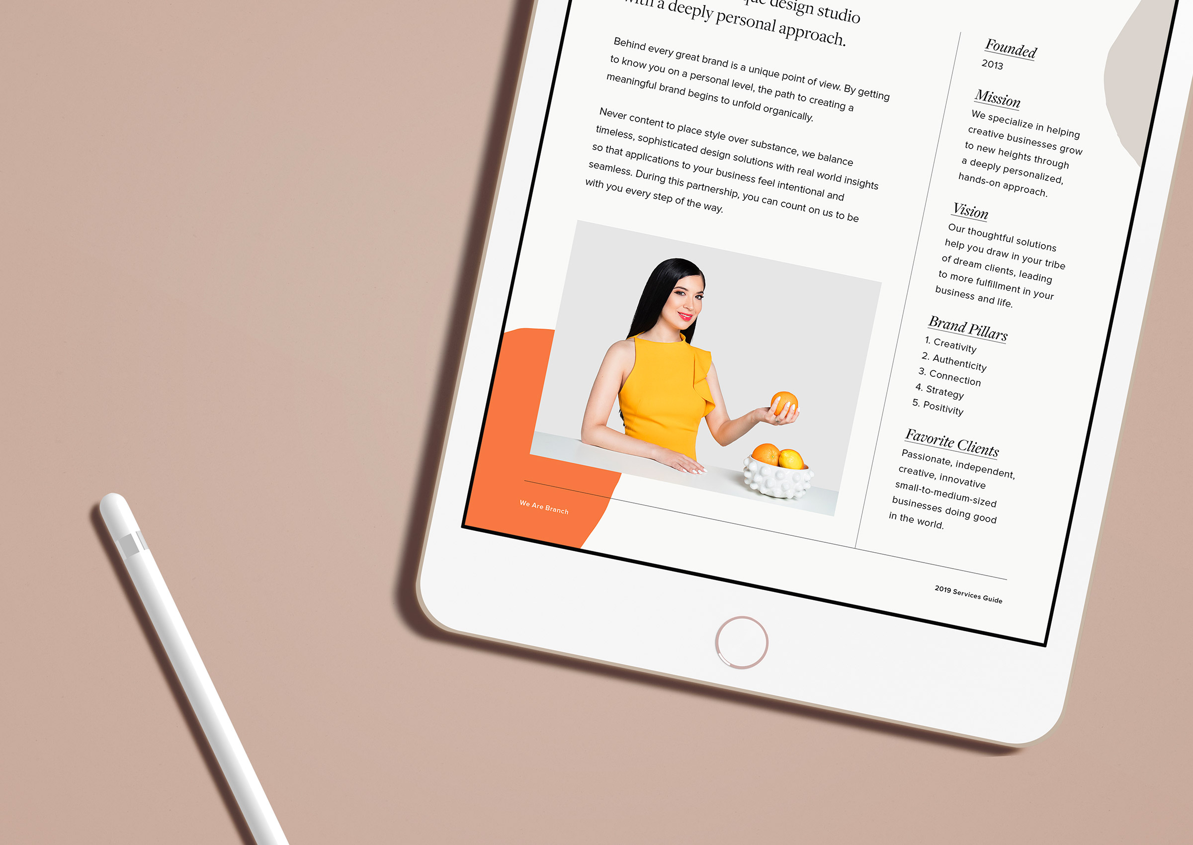
The to-do list grows and grows until one day it’s so overwhelming you’re not sure where to start. Last year was our busiest year by far and with that, a lot of small but significant items got put on hold including updates to our client services and process guides. These are an important part of the Branch process since they’re early touch points with potential clients — the services guide goes out after first contact and the process guide re-establishes the steps during our time together (The Branch Method) after our initial call.
The guides put our refreshed color palette to use (the cool gray was replaced with some warmer neutrals inspired by our new desert surroundings and a green swatch was added to represent growth) and were a great way to test it out beyond the Illustrator artboard.
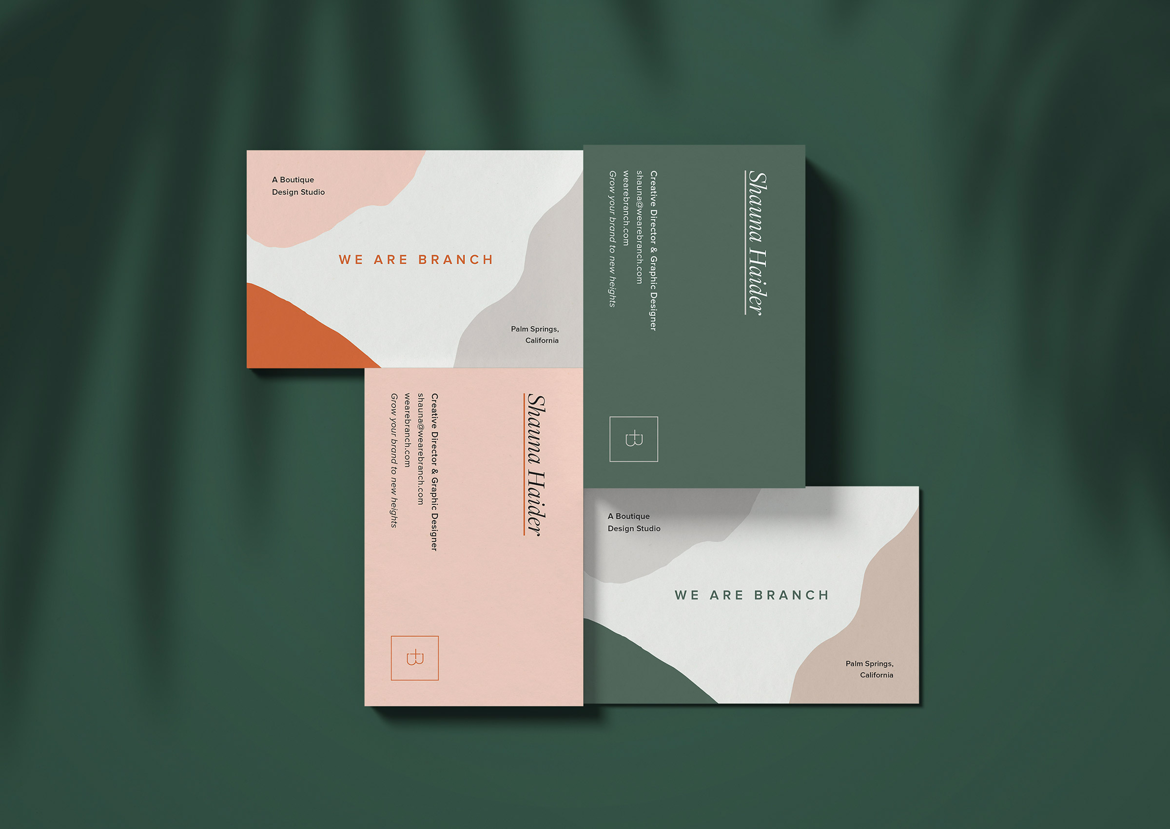
Once the guides were complete, it was time to move onto the fun pieces — business cards and postcards. These don’t require much information so it’s more of a fun visual exercise, moving colors, images and shapes until the composition clicks.
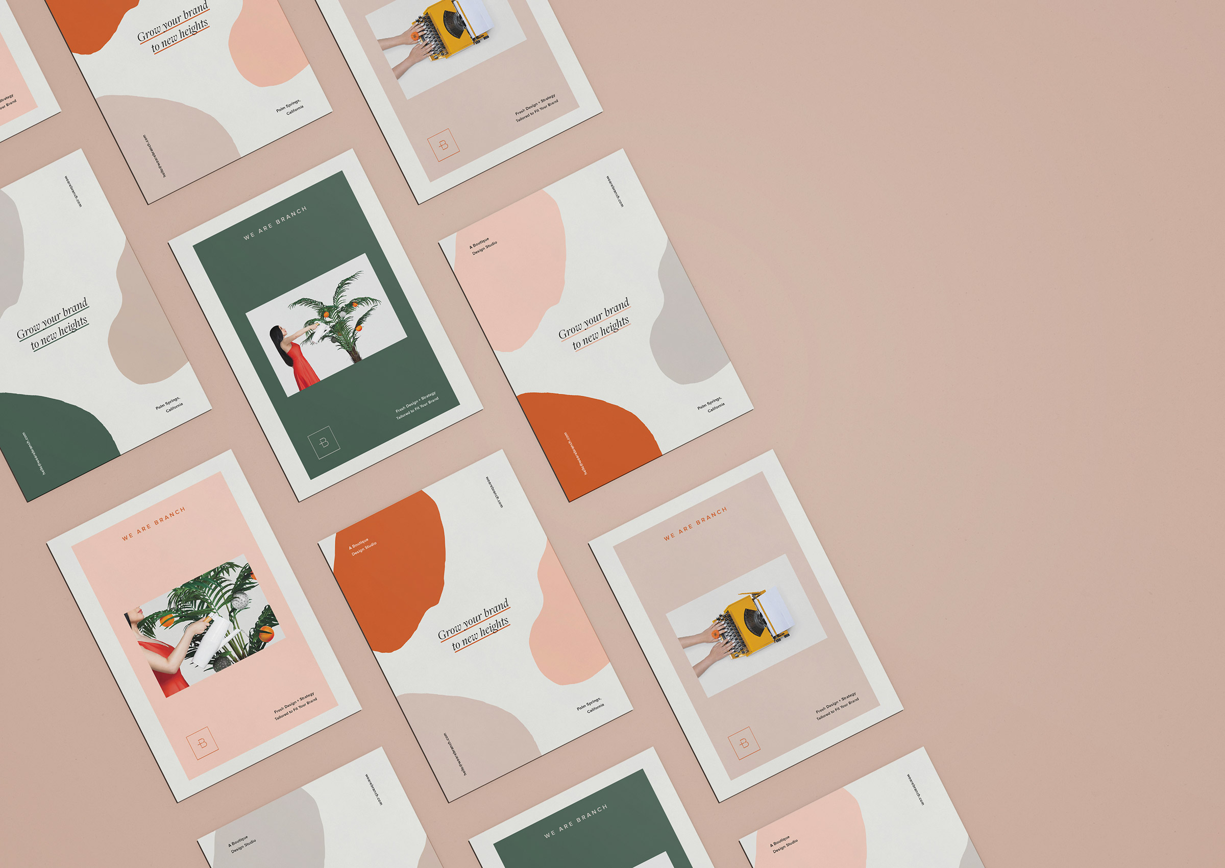
As a way to roll out the new color palette, three different combos were put into play to visually demonstrate how they worked together. These were all printed through Moo (use our referral to save 25% off your order!) on the Super stock which is thick with a velvety smooth, non-shiny finish.
The outcome is simple yet fresh with an artistic twist — a direct reflection of the types of clients we hope to partner with moving forward.
